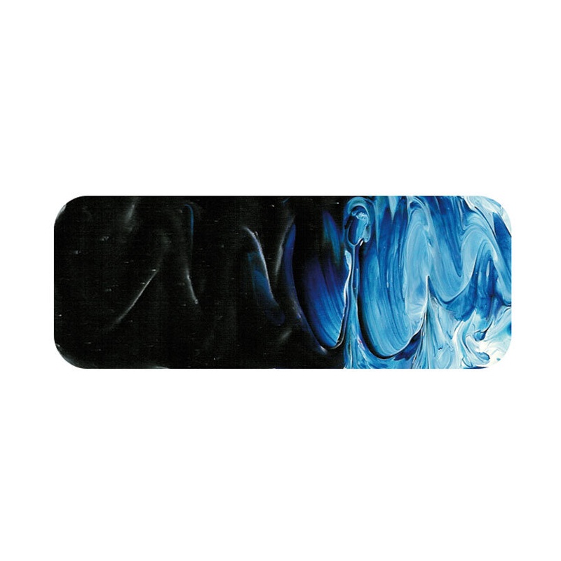
Matisse Prussian Blue is a real “wow factor” kind of color. The reason all acrylic ranges in the early days of acrylics had Phthalo Blue as the standard dark Blue color is that Prussian Blue was very sensitive to the alkaline environment of wet acrylic paint and so was very unstable. Prussian Blue was an industry standard but there had been little development work done on the color for over a hundred years and that didn’t matter to those who made it because the color was still selling well. it didn’t help that some grades were poorly made; after all, some manufacturers reasoned, a lot of this color is going to end up in laundry products and quality is not an issue in that case. This casual attitude extended to some unscrupulous artists materials manufacturers and so it was no wonder that Prussian Blue was gaining a spotty reputation during the mid 20th century. That was a pity because when well made, it is a superb pigment.
Chemical Description: Ferric amonium ferrocyanide
Pigment Numbers: PB27
Lightfastness Rating: ASTM II
Pigment Opacity: Transparent
Paint Opacity: Semi-Transparent
Series 1

